Size really does matter…Pixels vs Vector

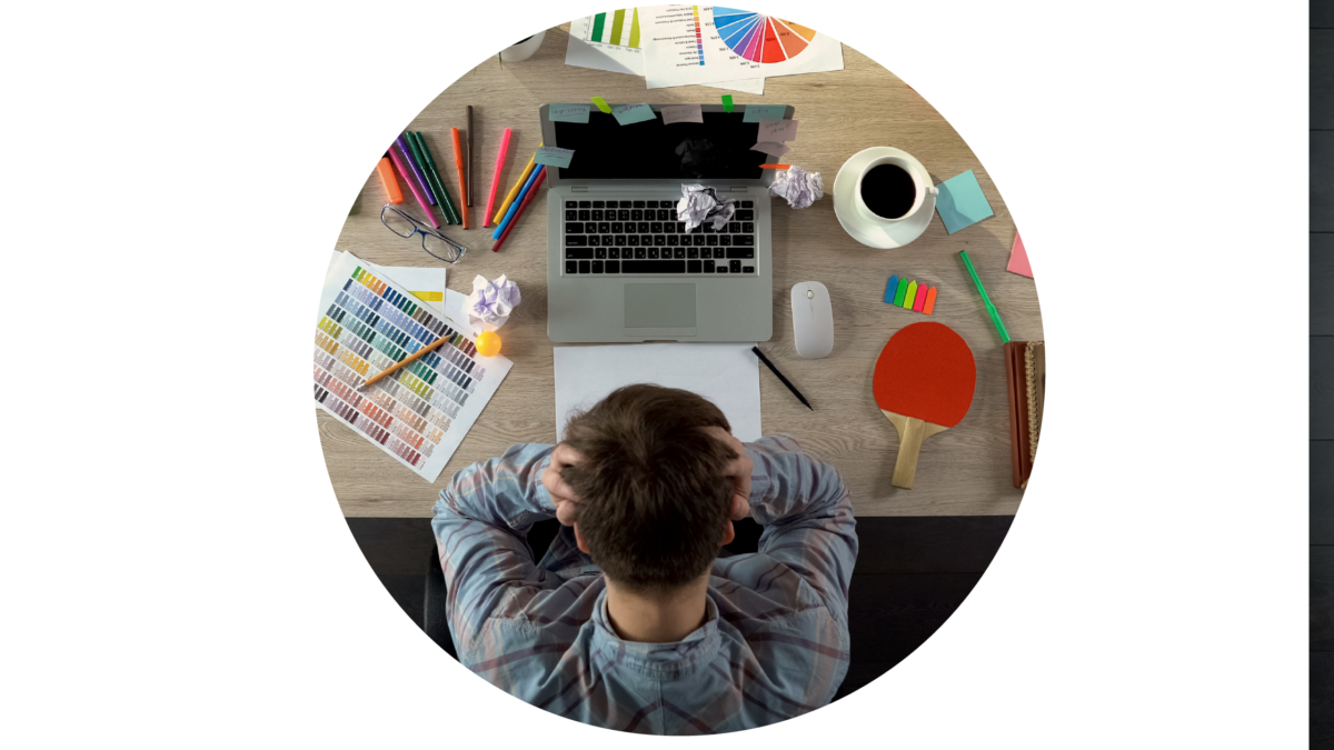
Navigating the world of digital images and which file format would fit which job is an area many of my customers get confused about. As designers, we forget it’s a language not everybody understands, and simply giving an image the correct file extension (.jpg for example) will not suddenly make everything clear and easy to understand.

This blog will explain, in a simple way, the differences between pixels and vectors, which to use, and when.
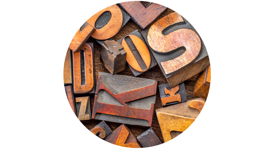
Pixelated Images

Let’s start with pixel-based images, these are images that have been created by camera or scanner and maybe have the file extensions .jpg, .png, .gif, .bmp after the file name. These types of images could also be created in a computer program like Photoshop, Elements, Pixel Art, etc. Look very closely at these images, zoom in, and you will see tiny squares of colour, a little like a mosaic – these are the pixels.

The squares are measured in square inches, so for instance, if you have an image that is 300dpi it means 300 dots (pixel squares) per inch.  If you want to enlarge this image to fit into a larger product, the little individual squares will grow, and this will make your image look blurred, fuzzy, and lacking in definition once you increase the image size. Trying to add more pixels per inch won’t help, as they will be added randomly and won’t produce good results. 

Low resolution images 72-150 dpi are used on digital platforms as they don’t need to be large and are quicker to render (show properly) on screen.

High resolution images are 300dpi and higher, these are needed for print to ensure they are not blurred.  The higher the dpi the sharper the image, especially if enlarged.

Vector Images

Vector images are files created in programs such as Illustrator, CAD, CorelDRAW and mainly have .pdf, .eps, .svg after the file name.

These images have been created by creating shapes and outlines, they are not made up of pixels, and do not rely on resolution as they are based on mathematical equations from one point to another forming lines and shapes.

You can edit colour, shapes, text layout etc. giving greater flexibility for images that need to change regularly for your brand or documents. This is why a vector image is best used for logos, illustrations, graphics, icons, and infographics. 

These files can be scaled up to whatever size you need and never lose any quality, no matter the size you need they will always look the same – from the size of business card to the size of a house.

These types of images are best applied to anything you are going to have printed, business cards, leaflets, clothing, signs, banners, brochures etc.

Where to use them.

Most printers or designers will ask for a .pdf or .eps format of your logo if they are using them in any design-work they are creating for you. This is because they can be changed into whatever format is needed. They are the most flexible file types because you cannot easily create a vector based image from a .jpg, .png or any other pixel file. There is a way designers can convert an image, but it is never a good quality conversion.

A designer may ask for a .jpg or a .png file and there is a difference in those two file types. A .jpg file will have a white solid background, whereas a .png file will have a transparent background. For example if you don’t have the logo in .pdf format but want your logo to be over the top of an image, or a different colour background on your website or social media, then a .png file is the best file to use

In conclusion

As you can see, in the context of graphic design at least, size really does matter!  If you don’t use the right file for the right job, it will really affect the quality of the marketing materials that your customers will see.  This in turn will reflect on the customer perception of the quality of your product or service before they even have a conversation with you.  Take pride in the way things look, as it will pay off.

Hopefully this brief explanation of the minefield of filenames and their uses  hasn’t blown your brain but has given you the insight to help you with being consistent with your brand.

Of course if you are truly stuck and have not got the right file format you can always get in touch with me, or any other designer or printer, and we will gladly help you out or explain a little further.

Below I have put together a handy table that might go a long way to helping you send the right file to the right job.

The Right Font for the Right Occasion

To most people one font is much like any other.  Most people will not notice the little nuances and tweaks that distinguish one font from another.  But be assured, your client’s subconscious brain will.

Before going any deeper into this blog, I think it may be helpful to have a little lesson on the terminology of the Typography world.

Typeface: is a family of fonts that make up a typeface.  So, for instance Garamond, Helvetica, Arial, Baskerville, etc.  This is the family, like my family name is Artliff.

Font: this is a specific element of the family typeface. So, for instance Garamond Bold Italic 12pt.  Carrying on with the family analogy I am Lisa Artliff, wife and mother, aged XX (a lady never reveals her age).  I am a specific part of the Artliff family.

Typography: This is the art of arranging typefaces and fonts to make the words legible, readable and eye-catching to whoever is reading them.

Some fonts are quite clearly different from one another, like the serif and san serif fonts

but with others, you have to look more closely.  According to a 2015 study by neuroscientists of Georgetown University Medical Centre, the brain recognises printed words as pictures rather than by their meaning.  The lead researcher, Maximilian Riesenhuber, reported, ‘Neurons in a small brain area remember how the whole word looks – using what could be called a visual dictionary.

What bearing does this have on which typeface and fonts you use?  Well, if you think about how we read words, if you use a font that reflects the opposite meaning to what you want to convey, your audiences’ brains will struggle to understand the meaning and context of the message you are trying to give.

For instance, in the example below I have used the same word but in different fonts, and as you can see, that one simple change can give the wrong meaning and personality to a word.

Now, this is a very crude, and some would say obvious example, but it demonstrates the concept simply.  But this can work at all levels of typography, from the title through to the body copy that you choose to use on your marketing materials.

For instance, a study in 2012 by filmmaker Errol Morris, demonstrated through a simple experiment how target audiences’ choices and opinions were quite clearly influenced by the font used.

He ran a quiz on the New York Times website called ‘Are You a Pessimist or an Optimist?’ His readers were asked to read a passage from a book by David Deutsch that declares, ‘Is it true that we live in an era of unprecedented safety?’  They were then asked if they agreed with the statement.  The passage that they read and the quiz that the 40,000+ people took afterwards was not the experiment; actually, it was how the audiences reacted to the statement and questions after reading the passage in randomly selected typefaces: Baskerville, Computer Modern, Georgia, Helvetica, Comic Sans, and Trebuchet (this was an automated choice, they had no knowledge that different typefaces were being seen by others).  The experiment showed audiences that had read the passage in Baskerville were more likely to agree with the statement (by a large margin) and Comic Sans produced the lowest agreement level (not many people would be surprised by that, myself included), with Helvetica not far behind Baskerville.

This was not a scientific university experiment, but nonetheless the findings are still interesting.  The audience clearly felt they trusted the statement more in the Baskerville typeface than Comic Sans, it was taken much more seriously and was more influential.

So, when I mentioned on my opening paragraph that your customers would subconsciously pick up on little nuances of the typeface that you choose, this experiment gives a small insight on how that can be the case.

In conclusion, when picking your typeface and fonts for your next campaign, bear this thought in mind…is the font I am using going to portray the right message to my audience, or is it going to hinder the whole thing?

Typefaces have personalities that can really help you get your messages across in more than just the words you use, so think about what reaction you want from your audience and what personality you want your words to have, and then go and find a typeface that best suits that need. 

Really LOOK at the individual letters and how they appear in words and paragraphs and decide if their combination is right for the tone you are trying to give. There are some really subtle differences in all the typefaces but they all can make a difference.  If you are looking for a serious and formal approach, then a serif typeface would probably fit the bill.   But if you want a no-nonsense direct approach that is clear and to the point, then a san serif would work well.

If you choose an accent or stand out typeface from your body copy, make sure that this is in keeping with the overall tone of your written piece and marketing message.

This also applies for any typefaces that you might be choosing for your branding.  Make sure that the typeface you choose reflects your brand personality, and that there can be no mixed messages in what your audience is seeing.

If you would like any help with your marketing to get the right typefaces and fonts, then please reach out and contact us and we can see how we can help you.

Resources

https://www.jneurosci.org/content/35/12/4965.short?sid=f7cae91d-da20-4de5-9bc1-da55ca38ef4f
https://opinionator.blogs.nytimes.com/2012/08/08/hear-all-ye-people-hearken-o-earth/

Should You Hire A Designer Before You Start Your Business?

There are so many things to consider when setting up your own business. From the name, through to whether you will be a sole trader, a limited company or even a partnership. It can be overwhelming, and you may feel as if you don’t know where to start.

One thing I can guarantee will be bottom of the list, is hiring a designer to sort out your brand, logo, and marketing materials.

Not because you don’t want to hire a designer, but because you have finite resources and need to use your money in other areas. You may also think to yourself, “How hard can this be? I have a computer and there’s plenty of websites out there to help me do it for free or for very little”. 

Let’s explore this a little more.

Do YOU have the time?

There are many things you need to consider and one of them is time, or to be precise YOUR time. As mentioned above there are many things that need to happen to get a business off the ground, and they all need one thing to make them happen… YOUR TIME.

How much time is needed is down to you and how you manage it. But one thing to take into consideration, is how long things can take, and a lot of that is based on your own knowledge and expertise. The more you know about a subject will determine how quickly you can accomplish it successfully. For instance, I had no knowledge of how to renovate and paint my kitchen cupboards, so I watched numerous YouTube videos and Googled several “how to’s” before I even felt confident to try.

Let’s look at all the things you need in order to begin a marketing strategy:

  • A logo – all businesses need to be recognised and a logo is a great start
  • Business cards, letterheads, and invoices
  • Website
  • Social media pages
  • Local advertising
  • Pop-up banners (for networking and events

In this age of technology, and the digital online world, there are many tools, apps, and online platforms which are free, or cost very little, that can help create the graphics that you need. The list of these is extensive:

  • Online social media and graphics builders
  • Cheap print companies that help you design as well
  • Free Image and vector supplies
  • Free website template builders
  • And much more

But as with anything, they are only as good as the person using them. Designing is more than slapping words and images on a page. Something looks good because the right combination of fonts, colours, images, and space, has been laid out with an expert eye, acquired from years of training and the understanding of what works and what doesn’t.

The template sites and apps make the templates look easy, but once you get into them, they never seem quite as simple as they first appeared!

They don’t quite seem to match each other, or there doesn’t seem to be a consistent look across all you do. Also the template builder isn’t easy to manipulate and you can’t quite get the look you’re after because you don’t understand how to make the changes you need to.

After all, I may know when a garden layout doesn’t look right, but I have no idea what plants would work best, or how many to plant and where for best effect (gardening is NOT one of my fortes).

So, you will become fed up and frustrated and rush your work, never really achieving the professional outcome you had in your head when you first began, many hours or even days before.

Are you happy with mediocre or using what other businesses use?

lack of time x lack of knowledge = mediocre or just ok

If you combine the two elements together and add in a dash of template design being used by thousands of other businesses around the world, you will end up with a brand that is just OK. Now don’t get me wrong, I am a big advocate of the saying ‘Good is good enough’. I spend far too many hours procrastinating on my own marketing, blogs, and social media because I don’t think they are good enough.

However, you have to make a business decision that you are going to be happy with mediocre, and not beat yourself up if your marketing doesn’t work how you want it to.

You also have to be mindful that you won’t be able to use any of the things you design as your unique brand going forward. Especially on the designs you build on print websites. Designing a logo on a business card on those sites will not give you a logo to use elsewhere. Always check the small print before you go too far down the line otherwise you could end up with a disjointed presence and no real brand.

Conclusion

We all know that money tends to drive a new business venture and you need to be putting this resource into the areas that matter. BUT another big important asset to the success of your business is YOU, and you have only a finite amount of time and energy. So work out which is the most appropriate use of your precious time…where can it do the most good?

With that in mind, is the time you need to invest in the design and production of your new brand, logo, and marketing, better placed in getting your product or service in tip top condition, or your premises ready, or your systems and processes in order and ready to go?

If you are sure you can do it all, that’s fine at least have a go, but assess as you go to make sure you are using your time and resources in the right way. And don’t be ashamed, or feel like you have let yourself down, if you need to pass it on to somebody else.Let’s face it we all start DIY projects at home and never quite achieve them, and then realise we should have let the expert do it in the first place to ensure a professional finish without giving ourselves the stress and hassle!

Do you want to talk more about your business and colours? Get in touch.