
A good comprehensive audit of your brand is an important exercise that every business should do, no matter what size they are. This consists of:
- revisiting strengths and weaknesses
- assessing your competitors and where you fit in
- looking at your audience to see if it has changed
- where you are positioned in your area
- how effective your brand voice is
- if your messages are getting across to your target market effectively
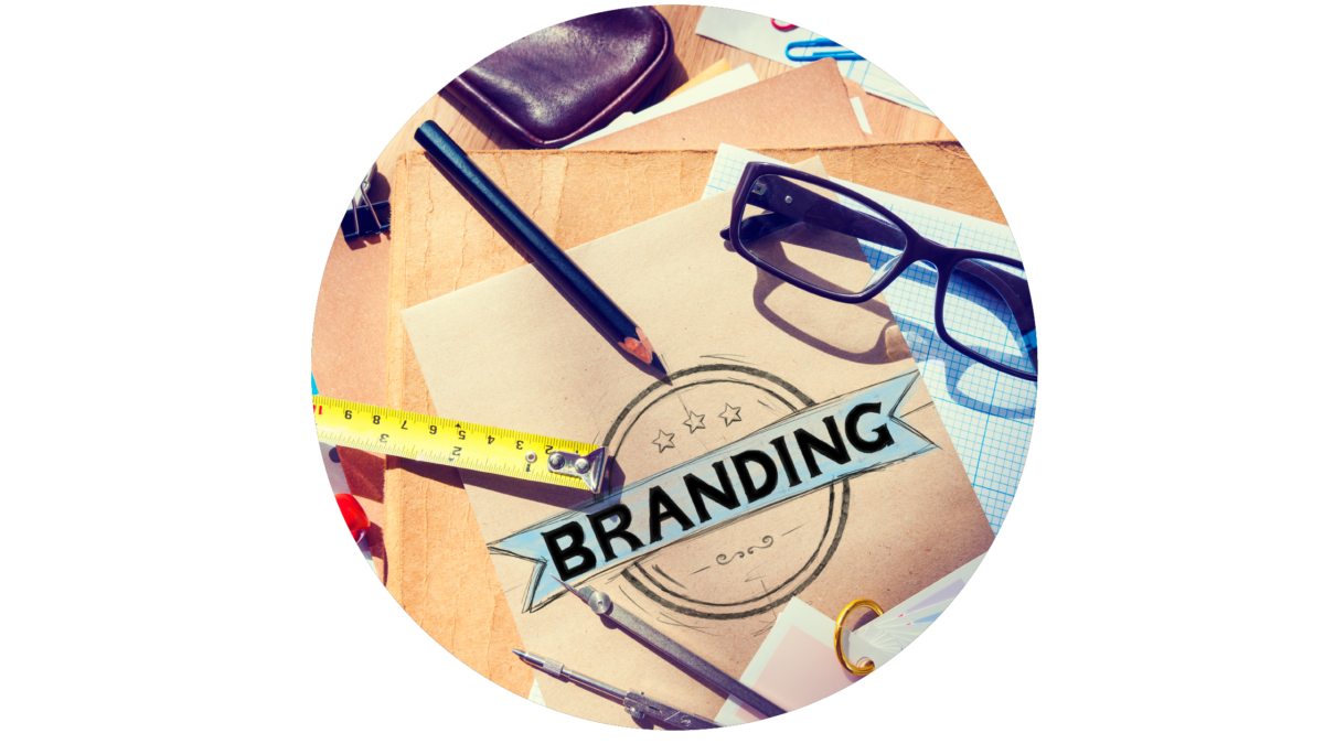
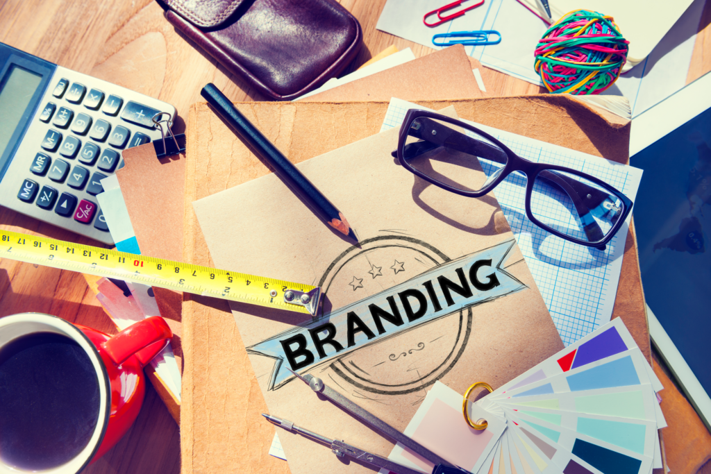
An important component of an overall brand audit is the visuals you use to get your messages across in order to attract your next customer. These are your logo, imagery, colours, typography, marketing material, stationery and anything that is seen by everyone.
The assessment of your visual brand should run alongside a wider brand audit and should also be informed by a fuller deeper analysis once it is done.
How often should you carry out a visual brand audit?
Think about it, you wouldn’t leave your car year after year without a service and MOT, so why would you leave the important elements of your business, the ones that keep it moving forward, for years and years without at least checking to see how effective they still are (or aren’t!). At least once a year you need to stop, look, and assess how your visual brand is doing – does it still portray your brand effectively or do you need to ‘tweak’ things a little?

Perform regular small reviews checking back to the goals and actions you have in place and adjust slightly if things are not going to plan. Going back to the car analogy, you wouldn’t go on a road and stay on there if it was taking you in the wrong direction, you would adjust your route. So, every 3- 4 month do a smaller review to ensure things are going in the right direction!
Why do a visual brand review?
It’s easy to fall in to ‘bad’ habits, become complacent and, as a business grows, it’s an easy option to just keep adding to what you do. Your brand can then start to look confused, muddled and lacking in focus. Things such as:
• using too many or wrong colours
• Inconsistent posting
• Inconsistent fonts
• no structure to important information
• no imagery, or imagery that doesn’t represent the brand correctly
• logo starting to change or being used wrongly, or even different logos
• low resolution images or logos
• untidy advertising in print or digital
• Inconsistent use of brand Not having a strong connected visual brand can damage the reputation of your business and lose you sales without you realising it. If your visual brand is messy, unorganised, inconsistent, and confusing, it will confuse your target audience, who may then go and seek clarity in your competitors business.
Good Visual communication is Powerful!
If you think about our earliest recorded forms of communication as humans, you think of cave paintings, which evolved to symbols and then ultimately the written word. Our brains are geared up to process visual information faster and more effectively than the written word or speech…60,000 times more quickly in fact. Images also evoke stronger reactions than words, as they are encoded in the part of the brain where emotions are processed.
Investment in your visual brand and materials can be powerful because this subliminal deeper cerebral messaging done consistently and effectively, helps customers see the value of your brand helping build trust and recognition.
How do you do a brand audit
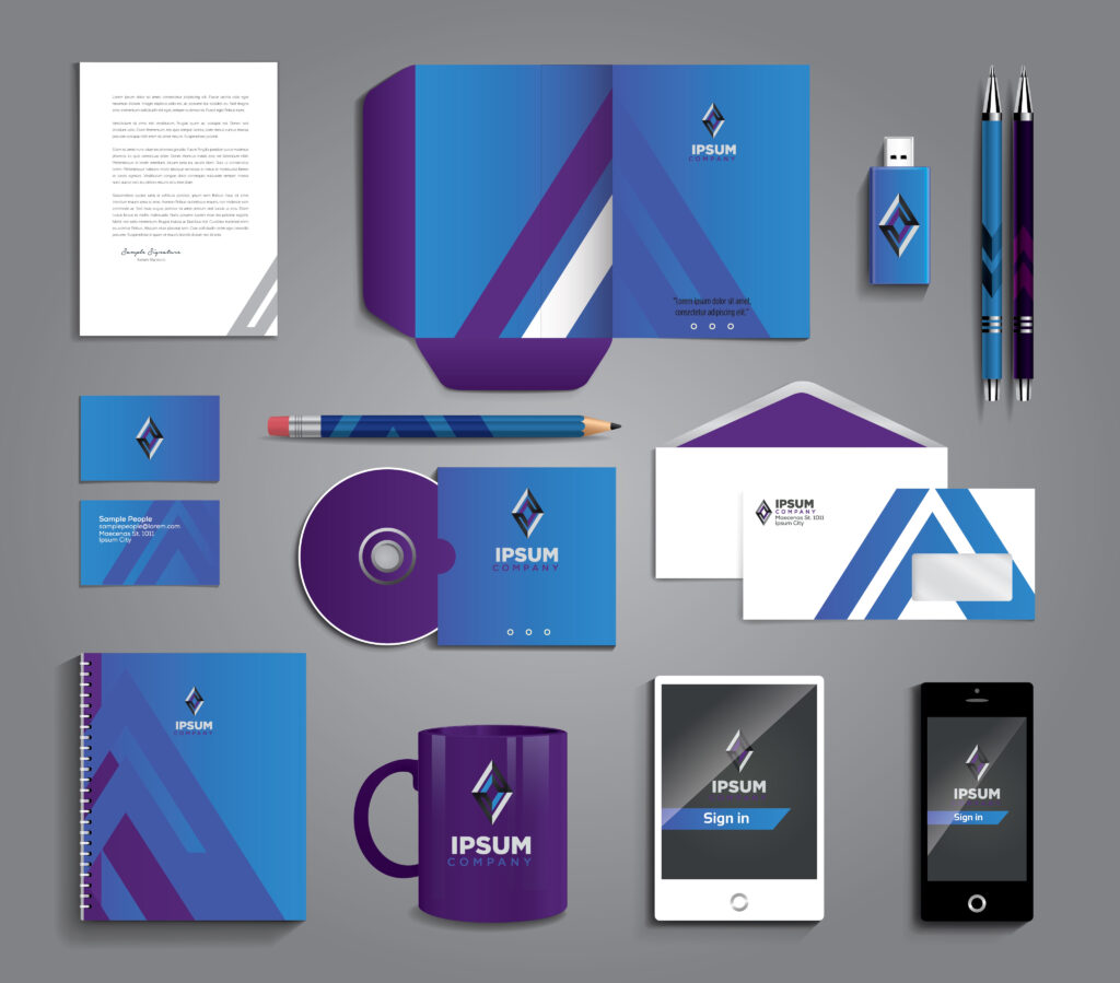
Collect all your marketing elements together in one place, from your logo and stationery to your social media and website, and everything in between. Then analyse all the elements used – logos, images, colours, fonts, print and digital materials, etc.
Ask questions like:
- Do they look like they are from the same company?
- Are you using the same language and sayings?
- Is anything out of place?
- Is there anything missing?
- Are the colours being used consistently across everything?
- Are the fonts being used in the right way and are they the correct ones?
- Are all the images used representing your company correctly and do they look consistent?
- Do the brand elements you are using, e.g. circles, lines, patterns, etc., look consistent?
- Are you getting the right important information across clearly?
You can do this on your own, but it would be even better with one or two more people, either colleagues or friends, as a fresh pair of eyes can give you a different perspective and pick up things that you take for granted.
What next?
Set out some actions, what needs to change, and prioritise accordingly, from most important to least. Decide if you need outside help from the likes of a graphic designer or web designer and task accordingly. Really grab the opportunity for changes because the impact will pay dividends.
If you subscribe to our newsletter below you can get our free visual brand audit sheet to help you.
If you need help with your visual brand audit, then don’t hesitate to give us a call 01773 317148 or drop us an email: hello@artliffdesign.com