
To most people one font is much like any other. Most people will not notice the little nuances and tweaks that distinguish one font from another. But be assured, your client’s subconscious brain will.
Before going any deeper into this blog, I think it may be helpful to have a little lesson on the terminology of the Typography world.
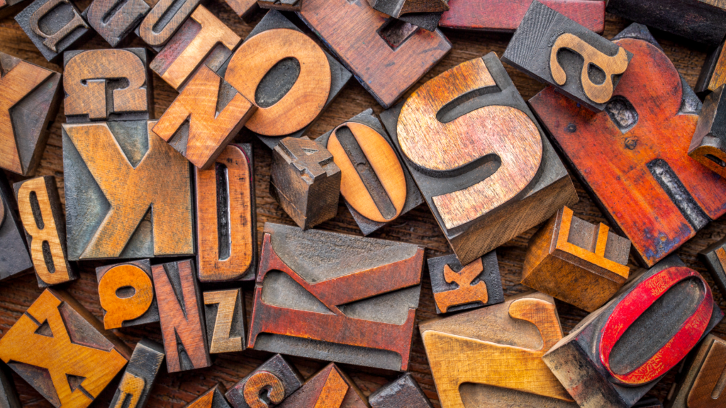
Typeface: is a family of fonts that make up a typeface. So, for instance Garamond, Helvetica, Arial, Baskerville, etc. This is the family, like my family name is Artliff.
Font: this is a specific element of the family typeface. So, for instance Garamond Bold Italic 12pt. Carrying on with the family analogy I am Lisa Artliff, wife and mother, aged XX (a lady never reveals her age). I am a specific part of the Artliff family.
Typography: This is the art of arranging typefaces and fonts to make the words legible, readable and eye-catching to whoever is reading them.
Some fonts are quite clearly different from one another, like the serif and san serif fonts

but with others, you have to look more closely. According to a 2015 study by neuroscientists of Georgetown University Medical Centre, the brain recognises printed words as pictures rather than by their meaning. The lead researcher, Maximilian Riesenhuber, reported, ‘Neurons in a small brain area remember how the whole word looks – using what could be called a visual dictionary.
What bearing does this have on which typeface and fonts you use? Well, if you think about how we read words, if you use a font that reflects the opposite meaning to what you want to convey, your audiences’ brains will struggle to understand the meaning and context of the message you are trying to give.

For instance, in the example below I have used the same word but in different fonts, and as you can see, that one simple change can give the wrong meaning and personality to a word.
Now, this is a very crude, and some would say obvious example, but it demonstrates the concept simply. But this can work at all levels of typography, from the title through to the body copy that you choose to use on your marketing materials.
For instance, a study in 2012 by filmmaker Errol Morris, demonstrated through a simple experiment how target audiences’ choices and opinions were quite clearly influenced by the font used.
He ran a quiz on the New York Times website called ‘Are You a Pessimist or an Optimist?’ His readers were asked to read a passage from a book by David Deutsch that declares, ‘Is it true that we live in an era of unprecedented safety?’ They were then asked if they agreed with the statement. The passage that they read and the quiz that the 40,000+ people took afterwards was not the experiment; actually, it was how the audiences reacted to the statement and questions after reading the passage in randomly selected typefaces: Baskerville, Computer Modern, Georgia, Helvetica, Comic Sans, and Trebuchet (this was an automated choice, they had no knowledge that different typefaces were being seen by others). The experiment showed audiences that had read the passage in Baskerville were more likely to agree with the statement (by a large margin) and Comic Sans produced the lowest agreement level (not many people would be surprised by that, myself included), with Helvetica not far behind Baskerville.
This was not a scientific university experiment, but nonetheless the findings are still interesting. The audience clearly felt they trusted the statement more in the Baskerville typeface than Comic Sans, it was taken much more seriously and was more influential.
So, when I mentioned on my opening paragraph that your customers would subconsciously pick up on little nuances of the typeface that you choose, this experiment gives a small insight on how that can be the case.
In conclusion, when picking your typeface and fonts for your next campaign, bear this thought in mind…is the font I am using going to portray the right message to my audience, or is it going to hinder the whole thing?
Typefaces have personalities that can really help you get your messages across in more than just the words you use, so think about what reaction you want from your audience and what personality you want your words to have, and then go and find a typeface that best suits that need.
Really LOOK at the individual letters and how they appear in words and paragraphs and decide if their combination is right for the tone you are trying to give. There are some really subtle differences in all the typefaces but they all can make a difference. If you are looking for a serious and formal approach, then a serif typeface would probably fit the bill. But if you want a no-nonsense direct approach that is clear and to the point, then a san serif would work well.
If you choose an accent or stand out typeface from your body copy, make sure that this is in keeping with the overall tone of your written piece and marketing message.
This also applies for any typefaces that you might be choosing for your branding. Make sure that the typeface you choose reflects your brand personality, and that there can be no mixed messages in what your audience is seeing.
If you would like any help with your marketing to get the right typefaces and fonts, then please reach out and contact us and we can see how we can help you.
Resources