Meet the Support Team

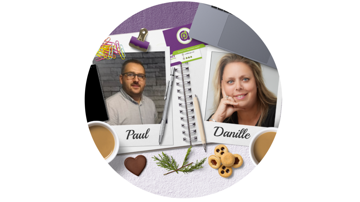
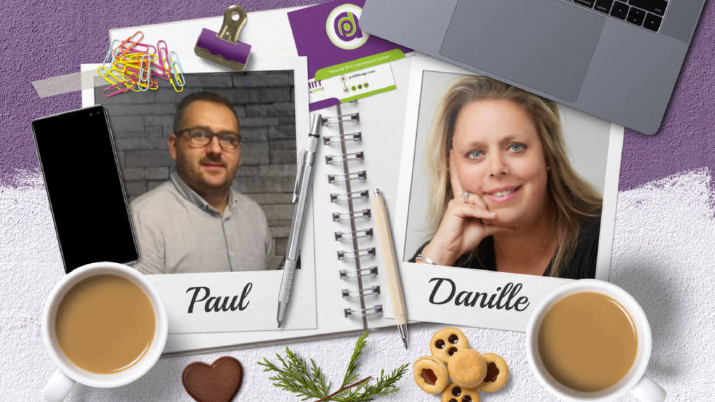
In our last meet the team blog you met our Sales team Paul & Danielle now, without further ado, we introduce the Support Team.

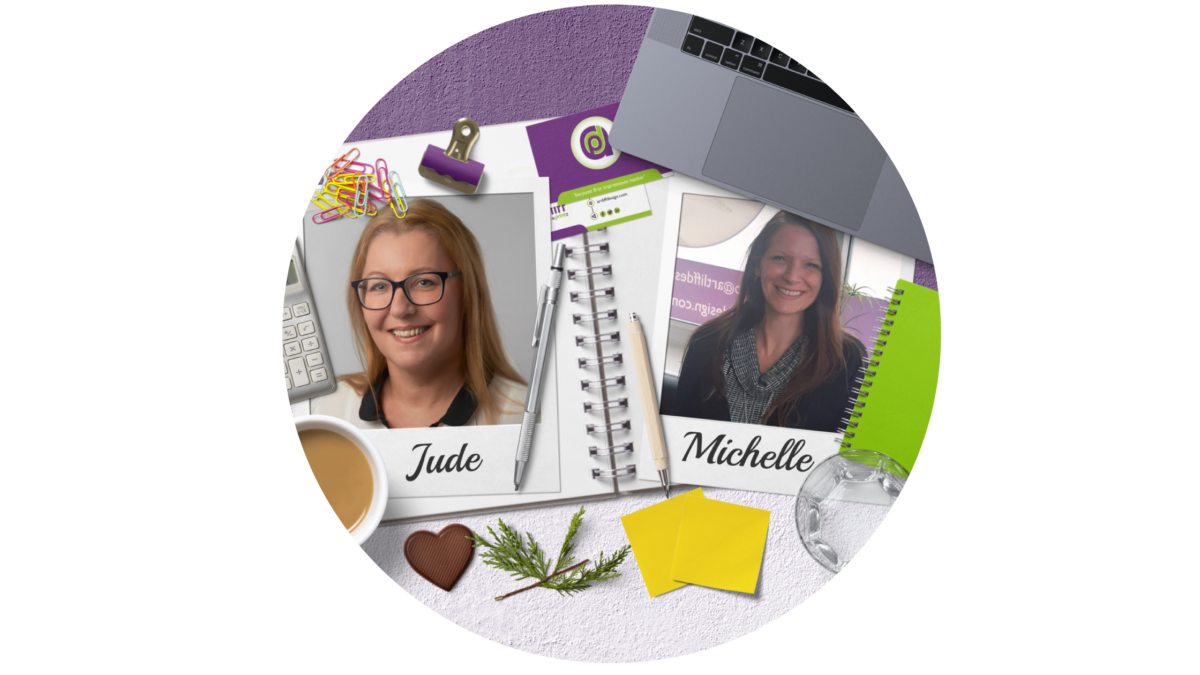
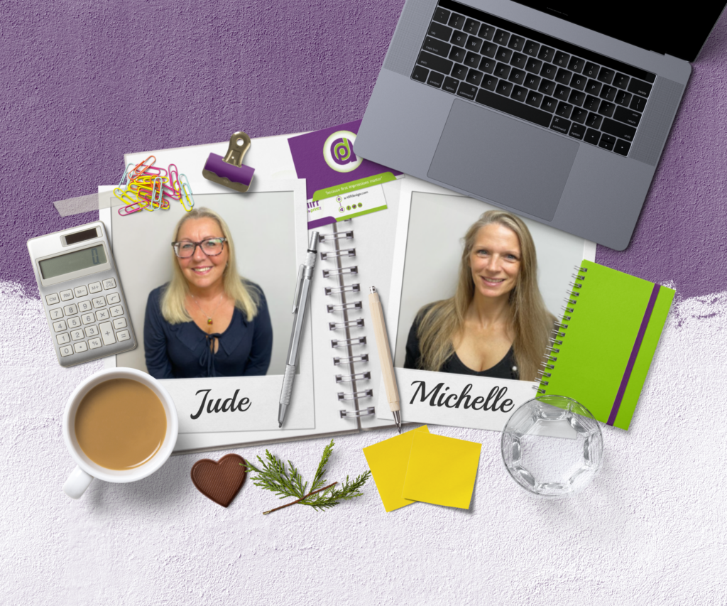
Our Support team is the glue that hold the team together! They make sure we are all working efficiently and with ease. Michelle and Jude the most organised of us all, and are charge of making sure everyone is happy, including our customers!

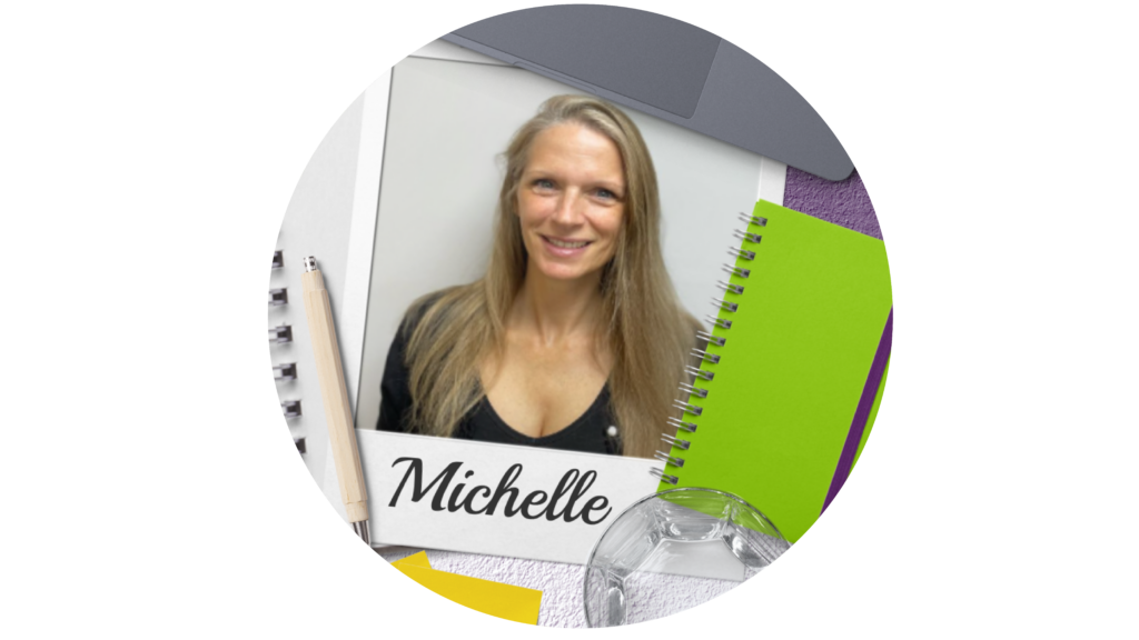
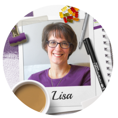
Michelle Outram – Office Manager

I have worked at a few places since leaving the Royal Navy and found that I enjoy all things administrative and organisational. I am processes driven and like to look at, revise and adapt, all parts of a business to make it work better with less effort.

What Motivates you?

Family, friends, goals and challenges

The favourite part of my job?

Everything, I can honestly say this is the first job I have ever had that has no aspects I dread. I love coming to work, it’s always interesting and very diverse. I work with, and for, people I have upmost respect for and consider them friends rather than just colleagues. We support each other, and I know they have my back.

One bit of advice for businesses?

Understanding that no team or part of the business is more important than the other. Treat people well and with respect and they will reward you with loyalty. 

My Favourite Colour?

Coral Pink as it reminds me of the beach.

Tea or Coffee?

Neither, as both make me violently sick. My hot drink is boiled water but would sack that off for a rum every time.

To be totally honest I have never been a massive fan of tea, I really have to be in the mood for it.

Favourite Biscuit?

All of them, food is a very important part of my day and biscuits rank highly. I like a Bourbon as a treat when I give blood (couldn’t buy them or I would eat the whole pack in one sitting), but my everyday treat would be a dark chocolate digestive.

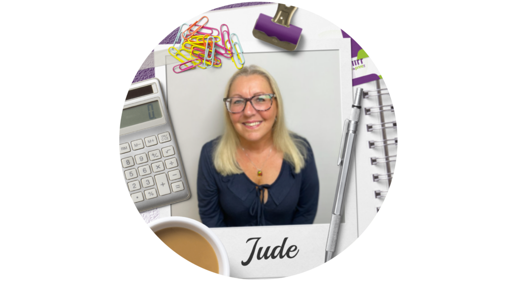
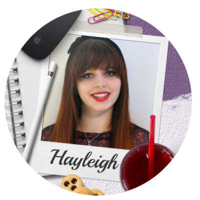
Jude Bunting – Account Manager

I’m Jude and I’ve worked here 3 years after finishing as a nurse due to ill health. I’m the geriatric of the team.

What motivates you?

Family and loyalty

Favourite colour?

Purple I think, although I do love pink or red.

Favourite part of your job?

The Credit Control part. I love ringing customers and building relationships with them. OK if I’m being truthful it’s getting the money in. I love it.

One bit of advice for business?  

Don’t get into debt you can’t afford and don’t treat your business bank account as your own personal one.

Tea or coffee?

Definitely coffee. Strong sweet and milky. 😊 

Favourite Biscuit?

Rich tea.

If you would like to know more about Artliff Design and how we can help you then please call us on 01773 317 148 and ask to speak to Danielle or Paul or email us on hello@artliffdesign.com

Visual Brand Audit!

A good comprehensive audit of your brand is an important exercise that every business should do, no matter what size they are. This consists of:

  • revisiting strengths and weaknesses
  • assessing your competitors and where you fit in
  • looking at your audience to see if it has changed
  • where you are positioned in your area
  • how effective your brand voice is
  • if your messages are getting across to your target market effectively

An important component of an overall brand audit is the visuals you use to get your messages across in order to attract your next customer. These are your logo, imagery, colours, typography, marketing material, stationery and anything that is seen by everyone.

The assessment of your visual brand should run alongside a wider brand audit and should  also be informed by a fuller deeper analysis once it is done.

How often should you carry out a visual brand audit?

Think about it, you wouldn’t leave your car year after year without a service and MOT, so why would you leave the important elements of your business, the ones that keep it moving forward, for years and years without at least checking to see how effective they still are (or aren’t!). At least once a year you need to stop, look, and assess how your visual brand is doing – does it still portray your brand effectively or do you need to ‘tweak’ things a little?

Perform regular small reviews checking back to the goals and actions you have in place and  adjust slightly if things are not going to plan. Going back to the car analogy, you wouldn’t go on a road and stay on there if it was taking you in the wrong direction, you would adjust your route. So, every 3- 4 month do a smaller review to ensure things are going in the right direction!

Why do a visual brand review?

It’s easy to fall in to ‘bad’ habits, become complacent and, as a business grows, it’s an easy option to just keep adding to what you do. Your brand can then start to look confused, muddled and lacking in focus. Things such as:

• using too many or wrong colours

• Inconsistent posting

• Inconsistent fonts

• no structure to important information

• no imagery, or imagery that doesn’t represent the brand correctly

• logo starting to change or being used wrongly, or even different logos

• low resolution images or logos

• untidy advertising in print or digital

• Inconsistent use of brand Not having a strong connected visual brand can damage the reputation of your business and lose you sales without you realising it. If your visual brand is messy, unorganised, inconsistent, and confusing, it will confuse your target audience, who may then go and seek clarity in your competitors business.

Good Visual communication is Powerful!

If you think about our earliest recorded forms of communication as humans, you think of cave paintings, which evolved to symbols and then ultimately the written word. Our brains are geared up to process visual information faster and more effectively than the written word or speech…60,000 times more quickly in fact. Images also evoke stronger reactions than words, as they are encoded in the part of the brain where emotions are processed.

Investment in your visual brand and materials can be powerful because this subliminal deeper cerebral messaging done consistently and effectively, helps customers see the value of your brand helping build trust and recognition.

How do you do a brand audit

Collect all your marketing elements together in one place, from your logo and stationery to your social media and website, and everything in between. Then analyse all the elements used – logos, images, colours, fonts, print and digital materials, etc.

Ask questions like:

  • Do they look like they are from the same company?
  • Are you using the same language and sayings?
  • Is anything out of place?
  • Is there anything missing?
  • Are the colours being used consistently across everything?
  • Are the fonts being used in the right way and are they the correct ones?
  • Are all the images used representing your company correctly and do they look consistent?
  • Do the brand elements you are using, e.g. circles, lines, patterns, etc., look consistent?
  • Are you getting the right important information across clearly?

You can do this on your own, but it would be even better with one or two more people, either colleagues or friends, as a fresh pair of eyes can give you a different perspective and pick up things that you take for granted.

What next?

Set out some actions, what needs to change, and prioritise accordingly, from most important to least. Decide if you need outside help from the likes of a graphic designer or web designer and task accordingly. Really grab the opportunity for changes because the impact will pay dividends.

If you subscribe to our newsletter below you can get our free visual brand audit sheet to help you.

If you need help with your visual brand audit, then don’t hesitate to give us a call 01773 317148 or drop us an email: hello@artliffdesign.com

Size really does matter…Pixels vs Vector

Navigating the world of digital images and which file format would fit which job is an area many of my customers get confused about. As designers, we forget it’s a language not everybody understands, and simply giving an image the correct file extension (.jpg for example) will not suddenly make everything clear and easy to understand.

This blog will explain, in a simple way, the differences between pixels and vectors, which to use, and when.

Pixelated Images

Let’s start with pixel-based images, these are images that have been created by camera or scanner and maybe have the file extensions .jpg, .png, .gif, .bmp after the file name. These types of images could also be created in a computer program like Photoshop, Elements, Pixel Art, etc. Look very closely at these images, zoom in, and you will see tiny squares of colour, a little like a mosaic – these are the pixels.

The squares are measured in square inches, so for instance, if you have an image that is 300dpi it means 300 dots (pixel squares) per inch.  If you want to enlarge this image to fit into a larger product, the little individual squares will grow, and this will make your image look blurred, fuzzy, and lacking in definition once you increase the image size. Trying to add more pixels per inch won’t help, as they will be added randomly and won’t produce good results. 

Low resolution images 72-150 dpi are used on digital platforms as they don’t need to be large and are quicker to render (show properly) on screen.

High resolution images are 300dpi and higher, these are needed for print to ensure they are not blurred.  The higher the dpi the sharper the image, especially if enlarged.

Vector Images

Vector images are files created in programs such as Illustrator, CAD, CorelDRAW and mainly have .pdf, .eps, .svg after the file name.

These images have been created by creating shapes and outlines, they are not made up of pixels, and do not rely on resolution as they are based on mathematical equations from one point to another forming lines and shapes.

You can edit colour, shapes, text layout etc. giving greater flexibility for images that need to change regularly for your brand or documents. This is why a vector image is best used for logos, illustrations, graphics, icons, and infographics. 

These files can be scaled up to whatever size you need and never lose any quality, no matter the size you need they will always look the same – from the size of business card to the size of a house.

These types of images are best applied to anything you are going to have printed, business cards, leaflets, clothing, signs, banners, brochures etc.

Where to use them.

Most printers or designers will ask for a .pdf or .eps format of your logo if they are using them in any design-work they are creating for you. This is because they can be changed into whatever format is needed. They are the most flexible file types because you cannot easily create a vector based image from a .jpg, .png or any other pixel file. There is a way designers can convert an image, but it is never a good quality conversion.

A designer may ask for a .jpg or a .png file and there is a difference in those two file types. A .jpg file will have a white solid background, whereas a .png file will have a transparent background. For example if you don’t have the logo in .pdf format but want your logo to be over the top of an image, or a different colour background on your website or social media, then a .png file is the best file to use

In conclusion

As you can see, in the context of graphic design at least, size really does matter!  If you don’t use the right file for the right job, it will really affect the quality of the marketing materials that your customers will see.  This in turn will reflect on the customer perception of the quality of your product or service before they even have a conversation with you.  Take pride in the way things look, as it will pay off.

Hopefully this brief explanation of the minefield of filenames and their uses  hasn’t blown your brain but has given you the insight to help you with being consistent with your brand.

Of course if you are truly stuck and have not got the right file format you can always get in touch with me, or any other designer or printer, and we will gladly help you out or explain a little further.

Below I have put together a handy table that might go a long way to helping you send the right file to the right job.

Meet the Sales Team

In our last meet the team blog you met our design team Lisa and Hayleigh now, without further ado, we introduce the sales team.

Without sales, you have no business. Whatever the business it will require a sales team and here at Artliff Design, we are no exception to that.  Our dynamic duo have a great rapport with our customers and work really hard to ensure they are happy with the services we provid.

Danielle Briggs – Sales Account Manager

Hi, My name is Danielle Briggs, I’m 42 years old, a single mum of two, a daughter aged 15 and a son aged 12. I also have two ‘fur babies’ my cats George and Penelope.

I enjoy going on holidays, often found getting down and dirty on a campsite within the UK LOL. I enjoy spending time with my friends and family, definitely a social butterfly, whenever there’s an event or party I’m there. I also love eating out, it’s also nice to have a cocktail or two (three or four) from time to time.

I have worked in Sales and Marketing for over 20 years, working within the home improvements industry and charity advertising for both local and national charities.  I have also worked in telecommunication and the construction industry, working on publications. I joined the Artliff team in August 2018.

What Motivates you?

Taking care of each and every one of my customers, building relationships to provid value and, in turn, helping them to grow their own businesses, community groups and charities.

The favourite part of my job?

Without a doubt is meeting so many different people. As I said, I’m definitely a social butterfly, I love meeting new people and thrive on the variety that comes with each new day.

One bit of advice for businesses?

Even when you are busy with work continue to promote yourself. This will give you a steady and continuous flow of work, so many companies I see having peaks and dips if they just continued whilst times are good they wouldn’t have so many dips.   

My favourite Colour?

Mine is actually a shade not a colour – Charcoal Grey, but I do like other shades of Grey too. 

Tea or Coffee?

To be totally honest I have never been a massive fan of tea, I really have to be in the mood for it.

I’m definitely a coffee drinker, milk, no sugar, (just in case I pop over to your office lol) my favourite is cappuccino.  

Favourite Biscuit?

I don’t really have a sweet tooth, however, I do like a biscuit from time to time.

Paul Brown – Sales Account Manager

Hello everybody my name is Paul and I am one half of the duo that makes up the sales team here at the Artliff Design & Print Ltd, I have been with the company nearly 2 years now.

I actually got into advertising sales by chance (well a friend telling me I could sell ice to Eskimos helped me make a decision to try). You could say, 6 & ½ years in, I did find my forte, I really enjoy helping companies promote and market their services and talking to a wide variety of people on a daily basis. 

What motivates you?

The things that motivate me are my children & wife, passion to win and self-learning.  Although I would also be lying if I did not mention money as well LOL!

Favourite colour?

My favourite colour actually depends what mood I am in, today its orange…

Favourite part of your job?

Most favourite part of my job is making a sale (if you could bottle that feeling I would sell it!).

One bit of advice for business?  

The one bit of advice I would give any new or established businesses is don’t tell people your next steps.

Tea or coffee?

I am a coffee drinker and nobody can talk to me until I have had my first cup in a morning 😊 

Favourite Biscuit?

My favourite biscuit would be a Malted Milk Biscuit definitely. Especially with the aforementioned first coffee of the morning.

If you would like to know more about Artliff Design and how we can help you then please call us on 01773 317 148 and ask to speak to Danielle or Paul or email us on hello@artliffdesign.com

One Minute to Success

Get your business noticed in 60 seconds or less

Closing the deal and converting prospects to customers is harder than you think. Your marketing, both online AND offline, may be amazing and yetgaining a new customer from a single interaction (view or click) is incredibly rare. This is why I am always going on about consistency and making sure you have a presence in as many places as possible.

In fact there is a marketing strategy that explains a little of the science behind these interactions. It’s called “The rule of seven”. This basically means that on average, you need seven interactions/touch points with your target audience before a purchase takes place. If you think about it, how many times do you buy on impulse after seeing a product or service for the first time? Especially a high price one. We all do research, find the best examples, look at reviews, ask friends for recommendations and much more. Only once we have done that do we feel confident enough to actually pick up the phone or send the email. Why then do you imagine your customers to be any different?

“Most B2B Buyers are already 57% of the way through the buying process before the first meeting”
Accenture, 2018

So many things can count as an interaction for instance:

  • Call from a company rep
  • Reading reviews
  • Adverts in magazines
  • Email newsletter
  • Recommendation
  • social media ads & posts
  • Google search
  • Exhibitions or events
  • Billboards
  • And so much more…

Anything that puts you at the forefront of your target audiences’ eyes or ears is an interaction.

How does this rule of seven work?

  1. The repetition helps cement your brand in your customers head. Just like learning lines or revising for an exam
  2. It helps close sales because you are already in your customers head.
  3. Staying visible over long periods of time helps the B2B slow process to buy.
  4. It puts you in the eye of your customers at the time they want to buy, and they remember they have seen you before.

What can you do to get your business seen in only 60 seconds?

Sometimes you only have a short space of time to grab your customer’s, so you need to mix the larger more detailed ways of marketing with some quick attention grabbing options. Here’s a few marketing ideas that grab the attention in 60 seconds or less.

Social Media.

Posting regularly, every week, and interacting with your customers on these platforms will

always put your business in your customers heads, building “know, like, and trust”. It may feel like it’s not working, but like trying to lose weight, persistence is the key, just keep going.

Vehicle graphics

How many times have you seen a particular van or car with business info on and then at some point think, ‘I have seen that loads of times’, or “That’s who I saw them in my local magazine’ or ‘That is who my friend used‘? We all have at some point. It can a quick and easy thing that is constantly being put in front of your target audience.

Short video

A short 30 second explainer video is a visually engaging bit of marketing that can be put on all your social media, website, emails, etc. More people engage with video than anything else so it can be very effective.

60 Second Elevator Pitch

Whether you network virtually or digitally, or if you speak to a lot of people regularly about your business, being able to explain your business in 60 seconds is a great tool to have. It’s

succinct and leaves your audience in no doubt as to what you do and how you can help them with their problems.

Branded work wear

A very quick way to get your brand recognised by your audience in 60 seconds is to make sure you are wearing your brand. This could be T-shirts, polo’s, hoodies, Jackets, caps, facemasks, etc.  It’s there in front of your audience eyes and works like a subliminal message. I have even had clients wear their apparel to the local pub when going for a quick drink and ending up with work from it.

Local magazine advert

Putting your business in your targeted area magazine is another good way to be seen in 60 seconds. People keep these magazines and use them like a directory. As they flick through the magazine, they will see your advert and if they have seen your van in the area and posts on social media, they will start connecting the dots.

Radio Advert

Lots of people will listen to load radio, so a catchy radio advert is a good way to put your business in your audiences head, so again when they see your brand in other places, they connect the advert to the business.

Email newsletter

Build a subscription list of your current customers and then build more from there. Most emails are read in a 60 second period and if you are popping up in your customers inbox on a regular basis and this puts you in the forefront of their minds.

Snail mail, leaflet, etc

Direct marketing, this the ‘old fashion’ way of promoting your business to your audience. However, because it isn’t regularly used anymore placing your business visual physically in their hands can be very effective. Yes, it may end up in the bin, but they have interacted with your business in another way, and it all adds up.

A Phone call

This can be 60 Seconds or 10 mins depending on how the conversation goes. Even if they do only engage for 60 seconds you have put your business name in front of your audience, and they can find out more about you if they wish to do so.

Conclusion

There are many more things that could be added to this list, it’s not exhaustive. However these are things that can be done for free, or for a small cost, to help get your business brand in front of your audience in under 60 Seconds. The more times you can do that, the more their awareness about your business will build. Which then in turn will convert into a consideration and ultimately a sale.

Remember you have to be “in it to win it” and that is no different with marketing. If you don’t find as many ways as possible to get in front of your audience, your chances of winning the sale will be lower. Try it, be consistent, keep going and your hard work will be rewarded.

If you need help with your marketing or creation of any materials, then don’t hesitate to get in touch, we can help you from a simple consultation to full design and marketing implementation.

Alternatively, you can subscribe to our newsletter to get regular hints, tips, and worksheets on a monthly basis to help you plan your marketing. Use the form below to subscribe now.

Meet the Design Team

As the team here at Artliff Design & Print Ltd continue to grow, we thought it might be nice to know us just that little bit more. This is the first in a series of blogs introducing us all, starting with the design team.

Obviously, the Design Department is the lifeblood of the business (of course I would say that, I am a bit biased, LOL!!) we take all our lovely clients projects and ideas and bring them to life, helping them to achieve their own marketing goals in order to grow and develop their business. Here are the two geniuses behind the lovey big Apple Mac screens making that happen.

Lisa Artliff – Senior Designer

Hello, I am Lisa Artliff the Senior Designer here at Artliff Design & Print Ltd and I make sure that all our client’s marketing materials are the best they can be, ensuring they are consistent with their brand identity for maximum impact.  I love all things creative and am absolutely nuts about branding and brand identity.  People who know me, know I looooovvvveeee to talk about the power of branding for any business.  There’s nothing I enjoy more than creating a new brand identity for existing or new businesses. 

I have been a graphic designer for over 30 years. I fell in love with the profession from my first college course at age of 16, and if anyone asks what my dream job was when I was a kid, I have to say it was to be a graphic designer.

What Motivates you?

Spending time with my family;  being creative every day both personally and professionally; seeing my clients happy and proud with their new brand identities and marketing materials, and adventures in our campervan ‘Macy’.

The favourite part of my job?

This is when I see my clients grow in excitement when we are developing their new brand identity.  Then ultimately when it is completed and they can start to use it across all their marketing materials and they realise how powerful this can be for them.  This just make me smile and gives me a great send of satisfaction in my job.  Its what I do it for.

One bit of advice for businesses?

It has to be consistent with your brand identity.  Make sure that your brand is across all your marketing materials, digitally and printed, and this will pay dividends in the long run.  The more your customers see you and recognise you across all platforms, the more they will think of you when they need your services.  Subliminal imagery, like your brand identity everywhere, is very powerful.  Remember the power of 7…It takes an average of 7 interactions with your business before they even start to think about buying from you.

My favourite Colour?

Really, do you need to ask…Purple of course.  I love it! It makes me happy, and I just love it. It is a creative colour and definitely inspires me.

Tea or Coffee?

Oh tea every time!!! Don’t mention coffee to me unless you have brought me a lactose free or Soya Latte from Costa or Starbucks (other coffee making establishments are available).

Favourite Biscuit?

OOOHH  that is hard…. It’s between a chocolate biscuit or a custard cream…but, if push came to shove, I think my hand would go towards the choccy biscuit!

Hayleigh Pollard – Creative Artworker & Administrative Assistant

Hi, I’m Hayleigh, I have 6 years of experience in the design & print industry. I love working in all things digital, from creating digital artwork to video design. At college, I completed an HND in interactive media, during this course I got to expand my knowledge and skills in web and digital graphic design, digital illustration, 3D modelling and animation, and video design.

I have always been into design and technology and always make sure I’m up to date with the latest trends. I’m really loving my time at Artliff and am looking forward to what the future holds.

What motivates you?

Learning new things. Training has always been something I am passionate about, from online systems to new tools on design software… I want to learn it all!

Favourite colour?

Pantone 3541 C or Teal – this colour is actually also going to be the colour I use for my wedding next year!

Favourite part of your job?

Being creative, creating adverts, graphics, and videos. I am learning so much at Artliff design and it helps working under a super talented senior graphic designer!

One bit of advice for business?  

Keep your designs relevant, make sure it reflects your business or brand and make it visually appealing to your client. The last thing you want to do is advertise your business and people not take you seriously.

Tea or coffee?

Neither, I hate them both! Pepsi max all the wayyyy… 

Favourite Biscuit?

Custard cream – which doesn’t make sense as I’m not the biggest fan of custard or cream! 

The Right Font for the Right Occasion

To most people one font is much like any other.  Most people will not notice the little nuances and tweaks that distinguish one font from another.  But be assured, your client’s subconscious brain will.

Before going any deeper into this blog, I think it may be helpful to have a little lesson on the terminology of the Typography world.

Typeface: is a family of fonts that make up a typeface.  So, for instance Garamond, Helvetica, Arial, Baskerville, etc.  This is the family, like my family name is Artliff.

Font: this is a specific element of the family typeface. So, for instance Garamond Bold Italic 12pt.  Carrying on with the family analogy I am Lisa Artliff, wife and mother, aged XX (a lady never reveals her age).  I am a specific part of the Artliff family.

Typography: This is the art of arranging typefaces and fonts to make the words legible, readable and eye-catching to whoever is reading them.

Some fonts are quite clearly different from one another, like the serif and san serif fonts

but with others, you have to look more closely.  According to a 2015 study by neuroscientists of Georgetown University Medical Centre, the brain recognises printed words as pictures rather than by their meaning.  The lead researcher, Maximilian Riesenhuber, reported, ‘Neurons in a small brain area remember how the whole word looks – using what could be called a visual dictionary.

What bearing does this have on which typeface and fonts you use?  Well, if you think about how we read words, if you use a font that reflects the opposite meaning to what you want to convey, your audiences’ brains will struggle to understand the meaning and context of the message you are trying to give.

For instance, in the example below I have used the same word but in different fonts, and as you can see, that one simple change can give the wrong meaning and personality to a word.

Now, this is a very crude, and some would say obvious example, but it demonstrates the concept simply.  But this can work at all levels of typography, from the title through to the body copy that you choose to use on your marketing materials.

For instance, a study in 2012 by filmmaker Errol Morris, demonstrated through a simple experiment how target audiences’ choices and opinions were quite clearly influenced by the font used.

He ran a quiz on the New York Times website called ‘Are You a Pessimist or an Optimist?’ His readers were asked to read a passage from a book by David Deutsch that declares, ‘Is it true that we live in an era of unprecedented safety?’  They were then asked if they agreed with the statement.  The passage that they read and the quiz that the 40,000+ people took afterwards was not the experiment; actually, it was how the audiences reacted to the statement and questions after reading the passage in randomly selected typefaces: Baskerville, Computer Modern, Georgia, Helvetica, Comic Sans, and Trebuchet (this was an automated choice, they had no knowledge that different typefaces were being seen by others).  The experiment showed audiences that had read the passage in Baskerville were more likely to agree with the statement (by a large margin) and Comic Sans produced the lowest agreement level (not many people would be surprised by that, myself included), with Helvetica not far behind Baskerville.

This was not a scientific university experiment, but nonetheless the findings are still interesting.  The audience clearly felt they trusted the statement more in the Baskerville typeface than Comic Sans, it was taken much more seriously and was more influential.

So, when I mentioned on my opening paragraph that your customers would subconsciously pick up on little nuances of the typeface that you choose, this experiment gives a small insight on how that can be the case.

In conclusion, when picking your typeface and fonts for your next campaign, bear this thought in mind…is the font I am using going to portray the right message to my audience, or is it going to hinder the whole thing?

Typefaces have personalities that can really help you get your messages across in more than just the words you use, so think about what reaction you want from your audience and what personality you want your words to have, and then go and find a typeface that best suits that need. 

Really LOOK at the individual letters and how they appear in words and paragraphs and decide if their combination is right for the tone you are trying to give. There are some really subtle differences in all the typefaces but they all can make a difference.  If you are looking for a serious and formal approach, then a serif typeface would probably fit the bill.   But if you want a no-nonsense direct approach that is clear and to the point, then a san serif would work well.

If you choose an accent or stand out typeface from your body copy, make sure that this is in keeping with the overall tone of your written piece and marketing message.

This also applies for any typefaces that you might be choosing for your branding.  Make sure that the typeface you choose reflects your brand personality, and that there can be no mixed messages in what your audience is seeing.

If you would like any help with your marketing to get the right typefaces and fonts, then please reach out and contact us and we can see how we can help you.

Resources

https://www.jneurosci.org/content/35/12/4965.short?sid=f7cae91d-da20-4de5-9bc1-da55ca38ef4f
https://opinionator.blogs.nytimes.com/2012/08/08/hear-all-ye-people-hearken-o-earth/

Launching your Website with a Bang!!

Here at Artiff Design & Print Ltd, we launched our new website last month after pushing it back down the to-do list many times.

It was such an exciting time for us and one we had been looking forward to for ages. After all, a website is one of the most important marketing tools a business can have. It is the beacon to guide the rest of your marketing material, both digital and print. It’s where you give more information about your business, a shop front, especially in today’s pandemic and post-pandemic worlds. You need your target audience to be able to see what you can do in one place, and feel connected to you before they even pick up the phone. So it’s vital you get it right, and more importantly that it’s launched properly, or all your hard work on your wonderful new website will be for nothing. All this got me thinking, so why don’t I give you some ideas to help you make the best of your new website launch.

REVIEW YOUR WEBSITE

  • Firstly, it may seem a silly thing to point out, but review every single page.
  • Make sure it has been thoroughly proofread by someone other than you, because you have been so close to the creation of it that you won’t pick things up, whereas someone else will see any errors. Fresh eyes will make a big difference.
  • Check that every button and link works as it should, and that the link goes where it is supposed to.
  • Check to make sure the styling is the same on every page, and the elements on each page are correct and fit in to the right colour themes, fonts, layout, etc that you have across the rest of your website pages.
  • Make sure every image and graphic you have in place is legal to use, and that there are no watermarks or that they are not blurred or fuzzy. Most importantly make sure they load up and don’t take too long to do so.
  • Set up your search SEO and keywords for every page to make sure you maximise every opportunity for your new clients to find you.
  • Test your website on different browsers and on mobile devices to ensure it is consistent across all platforms and nothing is out of place or pushed out of line.
  • Check every form goes where you want it to when it has been filled in and sent by your customers.
  • Have clear calls to action across the whole of your site to ensure your potential new clients know how to contact you.

MARKETING YOUR LAUNCH.

Whilst the reviews, checks and last minute adjustments are made, consider what you need to do on, and before launch day to make it a success. Here’s a few suggestions:

  • HAVE A LAUNCH PLAN
    It’s best to start with a plan for anything, but for a website launch it’s really important because as the day arrives it gets busier and busier, and more and more manic –  without a plan, it could all go pear shaped. Make clear decisions about what you want, and where you want to launch, and give yourself plenty of time to get everything done and ready before the launch actually happens. Think of this like an actual event and plan accordingly.
  • BUILD ANTICIPATION
    Use your social media platforms and networks to build anticipation and curiosity about what is going to happen on a set date. For example “watch this space for some exciting news”, or “What have we been working hard on for the last few months? All will be revealed soon”, and similar. Use graphics that are engaging, exciting and that give little clues to what the reveal will be. Keep it on brand and don’t start it too early or your readers will get bored. About a week before is long enough.
  • LAUNCH OFFER
    Maybe have an offer on your services or products for the launch. Something that is in keeping with your business and the launch. Now I am not saying reduce your prices but more add value to an existing service or product like, “a free box of chocolates with every massage”; or “free 15-minute consultation about your skin type” etc. The offers should be on a time-limited basis, this gives you something to keep pushing on the new website for the rest of the month.
  • EMAIL
    Email lists are really important and you all should be working to create one. They are a valuable marketing tool, for instance, in the case of your website launch you can inform your email list directly of the new site, as well as let them know about your offer(s) and then lead them directly to your offer page. Make sure it is clear how people can sign up to your email list from your new website as this can be something you use to promote the site on your marketing, social media, and printed literature. Also, ensure you set up an automated email response for when people sign up for your email list!
  • BLOGS/LATEST NEWS
    It’s a really good idea to have a blog or latest news page on your website. This is because it serves two purposes. One, it helps tell Google your website is active as you keep updating it with new content, and two, you have somewhere to keep directing traffic from your social media pages. For the launch of your website, have at least two blogs on there to get you started, and use them in the first month to keep drawing attention to your new website while you write the next ones!
  • GALLERY/TESTIMONIALS/NEW PRODUCT/SERVICES PAGE
    One, or a few of these, serve in much the same way as a Blog page. If you have one of these pages you can help to keep your website refreshed in Googles eyes and use as a driver to get people to pop along to your website to see more.
  • CONSISTENCY.
    Anyone who knows me well, says how I am a stickler for brand consistency. Never more so when you launch a big thing like a website for your business. You need to make sure your brand identity is visually consistent, so there can be no doubt in a prospective customer’s mind whose website they have landed on from your various marketing platforms. It builds trust and confidence in the company they are engaging with, shows they have full control of what they are doing, and know what they are saying. The same goes for consistent language across everything you write. Spend time to make sure this is spot on for launch day and beyond.

These are just a few of my own tips and ideas to help you make your launch day a success. I have no doubt there are many more that can be added, this is by no means an exhaustive list.

Whatever you choose to do for your own launch, planning is definitely key, we all know that even with the best planning, things can go wrong, and curve balls can be thrown at you. All will be Ok though if you stay true to your business brand and remain consistent in all you do.

There is no right or wrong way, the most important thing is that you have a great new website to reach your audience, and you just need to bask in this achievement and make the most that you can of it at every opportunity.

If you need help to build or launch a new website, please don’t hesitate to get in touch if you would like to know more!

Should You Hire A Designer Before You Start Your Business?

There are so many things to consider when setting up your own business. From the name, through to whether you will be a sole trader, a limited company or even a partnership. It can be overwhelming, and you may feel as if you don’t know where to start.

One thing I can guarantee will be bottom of the list, is hiring a designer to sort out your brand, logo, and marketing materials.

Not because you don’t want to hire a designer, but because you have finite resources and need to use your money in other areas. You may also think to yourself, “How hard can this be? I have a computer and there’s plenty of websites out there to help me do it for free or for very little”. 

Let’s explore this a little more.

Do YOU have the time?

There are many things you need to consider and one of them is time, or to be precise YOUR time. As mentioned above there are many things that need to happen to get a business off the ground, and they all need one thing to make them happen… YOUR TIME.

How much time is needed is down to you and how you manage it. But one thing to take into consideration, is how long things can take, and a lot of that is based on your own knowledge and expertise. The more you know about a subject will determine how quickly you can accomplish it successfully. For instance, I had no knowledge of how to renovate and paint my kitchen cupboards, so I watched numerous YouTube videos and Googled several “how to’s” before I even felt confident to try.

Let’s look at all the things you need in order to begin a marketing strategy:

  • A logo – all businesses need to be recognised and a logo is a great start
  • Business cards, letterheads, and invoices
  • Website
  • Social media pages
  • Local advertising
  • Pop-up banners (for networking and events

In this age of technology, and the digital online world, there are many tools, apps, and online platforms which are free, or cost very little, that can help create the graphics that you need. The list of these is extensive:

  • Online social media and graphics builders
  • Cheap print companies that help you design as well
  • Free Image and vector supplies
  • Free website template builders
  • And much more

But as with anything, they are only as good as the person using them. Designing is more than slapping words and images on a page. Something looks good because the right combination of fonts, colours, images, and space, has been laid out with an expert eye, acquired from years of training and the understanding of what works and what doesn’t.

The template sites and apps make the templates look easy, but once you get into them, they never seem quite as simple as they first appeared!

They don’t quite seem to match each other, or there doesn’t seem to be a consistent look across all you do. Also the template builder isn’t easy to manipulate and you can’t quite get the look you’re after because you don’t understand how to make the changes you need to.

After all, I may know when a garden layout doesn’t look right, but I have no idea what plants would work best, or how many to plant and where for best effect (gardening is NOT one of my fortes).

So, you will become fed up and frustrated and rush your work, never really achieving the professional outcome you had in your head when you first began, many hours or even days before.

Are you happy with mediocre or using what other businesses use?

lack of time x lack of knowledge = mediocre or just ok

If you combine the two elements together and add in a dash of template design being used by thousands of other businesses around the world, you will end up with a brand that is just OK. Now don’t get me wrong, I am a big advocate of the saying ‘Good is good enough’. I spend far too many hours procrastinating on my own marketing, blogs, and social media because I don’t think they are good enough.

However, you have to make a business decision that you are going to be happy with mediocre, and not beat yourself up if your marketing doesn’t work how you want it to.

You also have to be mindful that you won’t be able to use any of the things you design as your unique brand going forward. Especially on the designs you build on print websites. Designing a logo on a business card on those sites will not give you a logo to use elsewhere. Always check the small print before you go too far down the line otherwise you could end up with a disjointed presence and no real brand.

Conclusion

We all know that money tends to drive a new business venture and you need to be putting this resource into the areas that matter. BUT another big important asset to the success of your business is YOU, and you have only a finite amount of time and energy. So work out which is the most appropriate use of your precious time…where can it do the most good?

With that in mind, is the time you need to invest in the design and production of your new brand, logo, and marketing, better placed in getting your product or service in tip top condition, or your premises ready, or your systems and processes in order and ready to go?

If you are sure you can do it all, that’s fine at least have a go, but assess as you go to make sure you are using your time and resources in the right way. And don’t be ashamed, or feel like you have let yourself down, if you need to pass it on to somebody else.Let’s face it we all start DIY projects at home and never quite achieve them, and then realise we should have let the expert do it in the first place to ensure a professional finish without giving ourselves the stress and hassle!

Do you want to talk more about your business and colours? Get in touch.

The Importance of Colour

Whether you are aware of it or not, colour is very important in our lives and it impacts on everything we do.

It’s in the clothing choices we make, the rooms we decorate, the products we buy (or not as the case may be), in signs and signals that tell us what to do, and much more.

It’s a constant signal to our primal brain giving us visual signs about what we are seeing. For instance, is it fresh, is there danger ahead, or what season is it? According to CCI (Institute of Colour Research) colour is a big influence on the decisions we make, and the opinions we form within 90 seconds of seeing an image, product, logo, etc. 

Different cultures and personal experiences of colour have an impact on what people subliminally think and feel when they see any particular colour. 

For instance, let’s take red. This symbolises many things like danger, blood, warning, passion, and seduction. However, in some cultures, like China, it’s a colour of good luck, and in Greece it’s a symbol of heroism. In East Asia, red denotes a rise in the stock market, as opposed to Western cultures that use green.

Yellow is another example. This symbolises the sun, happiness, egg yolks, and optimism. However, it can also indicate cowardice, caution, and illness. And in Japan, on the other hand, it represents courage.

As you can see, looking at just two different colours, there are different impacts on many people depending on where they are in the world. So, how do you as a small business, navigate this potential minefield? 

  1. Start with your target audience, who is your business aimed at? Research them.
  2. What are you selling and/or service are you providing? Research them and the sector.
  3. Look at the colours you are thinking of using and look into their potential meaning to see if they help or hinder.
  4. Look at the different variances of your chosen colours to see if you have a connection to a particular tone.
  5. Don’t be afraid to go against the grain of your industries normal colour choices. Test the water with your chosen ones and get some feedback.

Whatever you choose, you need to be consistent with its application in everything you do with your business, even down to what you or your staff might wear.

Having a strong connection to the colours you choose is also important, that’s why the tone of the colour you choose is key as some people are more drawn to bright colours, and others to pastel. This is because you have to feel comfortable about your overall brand to be able to promote it with confidence and energy.

So to end, remember your colour choices are just as important as your business name and final logo images. The colours you choose are the first impression and can make a big impact.

Do you want to talk more about your business and colours? Get in touch; leave a thought or comment below.

Do you want to talk more about your business and colours? Get in touch.