Meet the Design Team

As the team here at Artliff Design & Print Ltd continue to grow, we thought it might be nice to know us just that little bit more. This is the first in a series of blogs introducing us all, starting with the design team.

Obviously, the Design Department is the lifeblood of the business (of course I would say that, I am a bit biased, LOL!!) we take all our lovely clients projects and ideas and bring them to life, helping them to achieve their own marketing goals in order to grow and develop their business. Here are the two geniuses behind the lovey big Apple Mac screens making that happen.

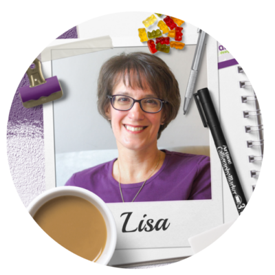
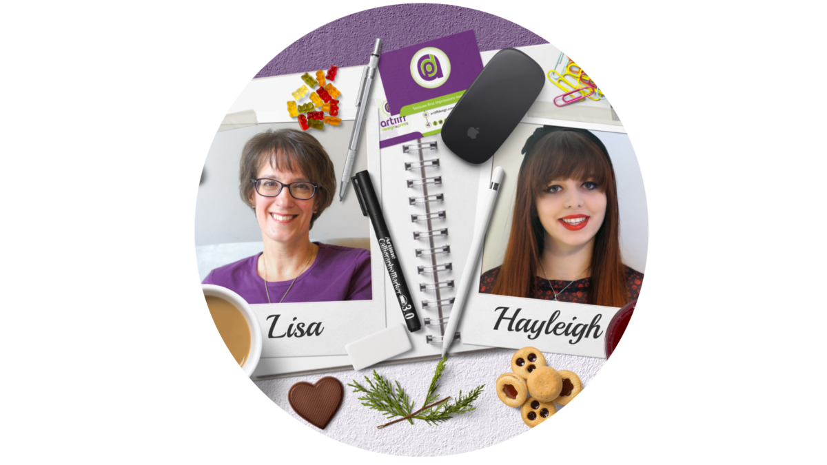
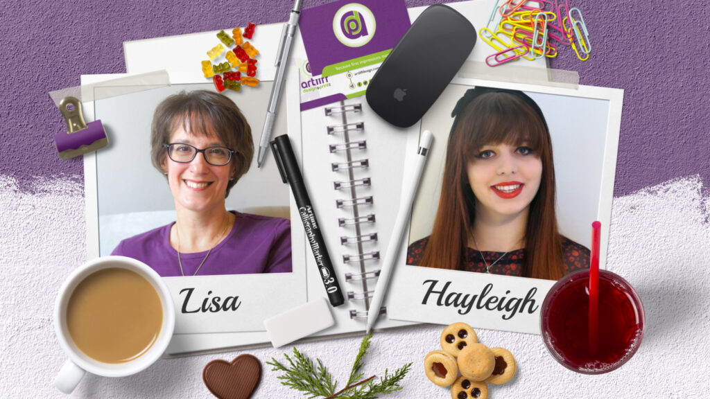
Lisa Artliff – Senior Designer

Hello, I am Lisa Artliff the Senior Designer here at Artliff Design & Print Ltd and I make sure that all our client’s marketing materials are the best they can be, ensuring they are consistent with their brand identity for maximum impact.  I love all things creative and am absolutely nuts about branding and brand identity.  People who know me, know I looooovvvveeee to talk about the power of branding for any business.  There’s nothing I enjoy more than creating a new brand identity for existing or new businesses. 

I have been a graphic designer for over 30 years. I fell in love with the profession from my first college course at age of 16, and if anyone asks what my dream job was when I was a kid, I have to say it was to be a graphic designer.

What Motivates you?

Spending time with my family;  being creative every day both personally and professionally; seeing my clients happy and proud with their new brand identities and marketing materials, and adventures in our campervan ‘Macy’.

The favourite part of my job?

This is when I see my clients grow in excitement when we are developing their new brand identity.  Then ultimately when it is completed and they can start to use it across all their marketing materials and they realise how powerful this can be for them.  This just make me smile and gives me a great send of satisfaction in my job.  Its what I do it for.

One bit of advice for businesses?

It has to be consistent with your brand identity.  Make sure that your brand is across all your marketing materials, digitally and printed, and this will pay dividends in the long run.  The more your customers see you and recognise you across all platforms, the more they will think of you when they need your services.  Subliminal imagery, like your brand identity everywhere, is very powerful.  Remember the power of 7…It takes an average of 7 interactions with your business before they even start to think about buying from you.

My favourite Colour?

Really, do you need to ask…Purple of course.  I love it! It makes me happy, and I just love it. It is a creative colour and definitely inspires me.

Tea or Coffee?

Oh tea every time!!! Don’t mention coffee to me unless you have brought me a lactose free or Soya Latte from Costa or Starbucks (other coffee making establishments are available).

Favourite Biscuit?

OOOHH  that is hard…. It’s between a chocolate biscuit or a custard cream…but, if push came to shove, I think my hand would go towards the choccy biscuit!

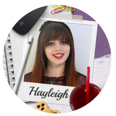
Hayleigh Pollard – Creative Artworker & Administrative Assistant

Hi, I’m Hayleigh, I have 6 years of experience in the design & print industry. I love working in all things digital, from creating digital artwork to video design. At college, I completed an HND in interactive media, during this course I got to expand my knowledge and skills in web and digital graphic design, digital illustration, 3D modelling and animation, and video design.

I have always been into design and technology and always make sure I’m up to date with the latest trends. I’m really loving my time at Artliff and am looking forward to what the future holds.

What motivates you?

Learning new things. Training has always been something I am passionate about, from online systems to new tools on design software… I want to learn it all!

Favourite colour?

Pantone 3541 C or Teal – this colour is actually also going to be the colour I use for my wedding next year!

Favourite part of your job?

Being creative, creating adverts, graphics, and videos. I am learning so much at Artliff design and it helps working under a super talented senior graphic designer!

One bit of advice for business?  

Keep your designs relevant, make sure it reflects your business or brand and make it visually appealing to your client. The last thing you want to do is advertise your business and people not take you seriously.

Tea or coffee?

Neither, I hate them both! Pepsi max all the wayyyy… 

Favourite Biscuit?

Custard cream – which doesn’t make sense as I’m not the biggest fan of custard or cream! 

The Right Font for the Right Occasion

To most people one font is much like any other.  Most people will not notice the little nuances and tweaks that distinguish one font from another.  But be assured, your client’s subconscious brain will.

Before going any deeper into this blog, I think it may be helpful to have a little lesson on the terminology of the Typography world.

Typeface: is a family of fonts that make up a typeface.  So, for instance Garamond, Helvetica, Arial, Baskerville, etc.  This is the family, like my family name is Artliff.

Font: this is a specific element of the family typeface. So, for instance Garamond Bold Italic 12pt.  Carrying on with the family analogy I am Lisa Artliff, wife and mother, aged XX (a lady never reveals her age).  I am a specific part of the Artliff family.

Typography: This is the art of arranging typefaces and fonts to make the words legible, readable and eye-catching to whoever is reading them.

Some fonts are quite clearly different from one another, like the serif and san serif fonts

but with others, you have to look more closely.  According to a 2015 study by neuroscientists of Georgetown University Medical Centre, the brain recognises printed words as pictures rather than by their meaning.  The lead researcher, Maximilian Riesenhuber, reported, ‘Neurons in a small brain area remember how the whole word looks – using what could be called a visual dictionary.

What bearing does this have on which typeface and fonts you use?  Well, if you think about how we read words, if you use a font that reflects the opposite meaning to what you want to convey, your audiences’ brains will struggle to understand the meaning and context of the message you are trying to give.

For instance, in the example below I have used the same word but in different fonts, and as you can see, that one simple change can give the wrong meaning and personality to a word.

Now, this is a very crude, and some would say obvious example, but it demonstrates the concept simply.  But this can work at all levels of typography, from the title through to the body copy that you choose to use on your marketing materials.

For instance, a study in 2012 by filmmaker Errol Morris, demonstrated through a simple experiment how target audiences’ choices and opinions were quite clearly influenced by the font used.

He ran a quiz on the New York Times website called ‘Are You a Pessimist or an Optimist?’ His readers were asked to read a passage from a book by David Deutsch that declares, ‘Is it true that we live in an era of unprecedented safety?’  They were then asked if they agreed with the statement.  The passage that they read and the quiz that the 40,000+ people took afterwards was not the experiment; actually, it was how the audiences reacted to the statement and questions after reading the passage in randomly selected typefaces: Baskerville, Computer Modern, Georgia, Helvetica, Comic Sans, and Trebuchet (this was an automated choice, they had no knowledge that different typefaces were being seen by others).  The experiment showed audiences that had read the passage in Baskerville were more likely to agree with the statement (by a large margin) and Comic Sans produced the lowest agreement level (not many people would be surprised by that, myself included), with Helvetica not far behind Baskerville.

This was not a scientific university experiment, but nonetheless the findings are still interesting.  The audience clearly felt they trusted the statement more in the Baskerville typeface than Comic Sans, it was taken much more seriously and was more influential.

So, when I mentioned on my opening paragraph that your customers would subconsciously pick up on little nuances of the typeface that you choose, this experiment gives a small insight on how that can be the case.

In conclusion, when picking your typeface and fonts for your next campaign, bear this thought in mind…is the font I am using going to portray the right message to my audience, or is it going to hinder the whole thing?

Typefaces have personalities that can really help you get your messages across in more than just the words you use, so think about what reaction you want from your audience and what personality you want your words to have, and then go and find a typeface that best suits that need. 

Really LOOK at the individual letters and how they appear in words and paragraphs and decide if their combination is right for the tone you are trying to give. There are some really subtle differences in all the typefaces but they all can make a difference.  If you are looking for a serious and formal approach, then a serif typeface would probably fit the bill.   But if you want a no-nonsense direct approach that is clear and to the point, then a san serif would work well.

If you choose an accent or stand out typeface from your body copy, make sure that this is in keeping with the overall tone of your written piece and marketing message.

This also applies for any typefaces that you might be choosing for your branding.  Make sure that the typeface you choose reflects your brand personality, and that there can be no mixed messages in what your audience is seeing.

If you would like any help with your marketing to get the right typefaces and fonts, then please reach out and contact us and we can see how we can help you.

Resources

https://www.jneurosci.org/content/35/12/4965.short?sid=f7cae91d-da20-4de5-9bc1-da55ca38ef4f
https://opinionator.blogs.nytimes.com/2012/08/08/hear-all-ye-people-hearken-o-earth/